Shells
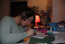
After looking at both Richard Sweeney's and Jen Stark's work, I decided I wanted to take elements from each designers' principles to combine the two styles. I think the vibrant colours in Stark's work really brought the designs together, being a key element of her artwork. I wanted to take this and combine it with my own take on Sweeney's shell pieces which I have earlier elaborated on.
The outcome was this; a bright, shocking shade of pink which I could see featuring in any one of Jen Stark's pieces. This really contrasts with the smooth, delicate outlines of the shell- shape which I have stapled together. I don't think that a contrast this big really works, it sets the design away from its simplicity, which Sweeney really managed to exaggerate, using the most basic colouring and photography.

posted by chelseyhobbs at
13:25
![]()

0 Comments:
Post a Comment
Subscribe to Post Comments [Atom]
<< Home